Logo & visual identity for a non-profit
The Creative Brief
The Client
Alberta Native Bee Council is a non-profit organization whose mission is to promote native pollinator communities through research and monitoring, advocacy, education, and collaboration with others.
The Project
I was tasked with creating a full visual identity package targeted toward the general public. It had to relate to people on a personal level while projecting a clear message about their organization.
Requirements
The client required the logo to have a reference to the province of Alberta while not referring to honey bees, honey, or sweeteners.


Logo Development
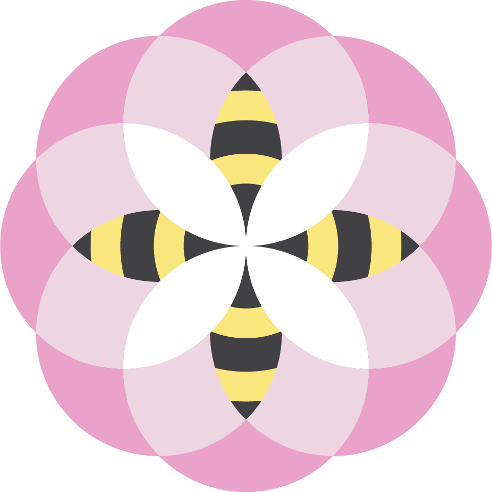
The main challenge I had was developing an eye-catching logo that would connect with the general public and represent what the organization was about, without being a literal depiction of a bee or flower.
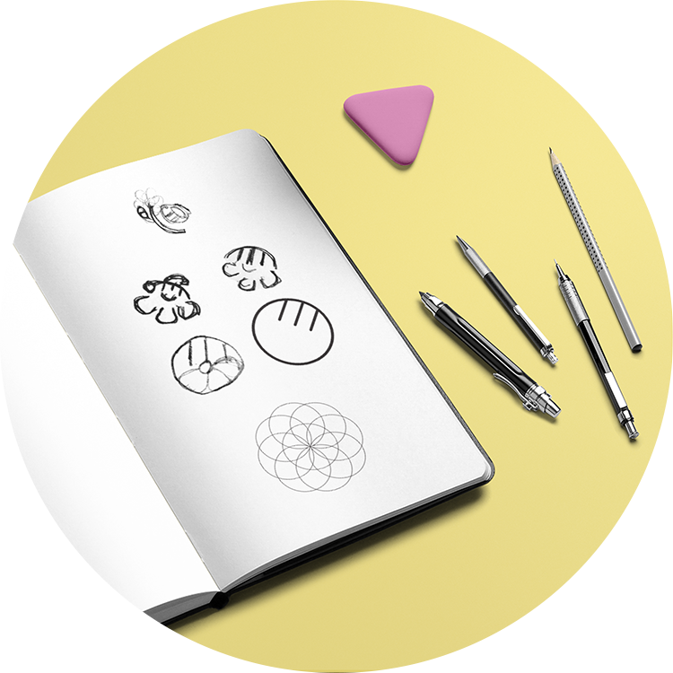
1. The process started by sketching bees and flowers
2. I then combined the two into one form
3. Having landed on a circular form, I repeated it in a geometric shape resembling a flower
The resulting mark became a geometric Alberta Wild Rose with Bumble Bees forming the center. These forms were created by filling colour into the spaces where the circles overlapped in the outline sketch.
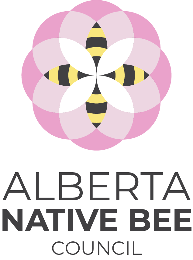
The typographical aspect emphasizes "Alberta" and "Native Bee" using changes in size and weight to the font Montserrat. "Alberta" and "Native Bee" take up the same width of space with "council" centered underneath to maintain a symmetrical appearance.
Visual Identity
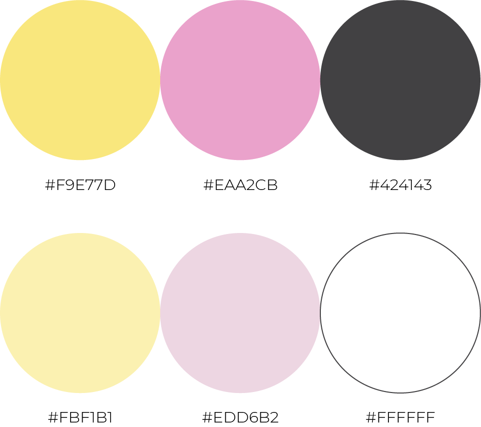
Colour
Hues were taken directly from photos of a Wild Rose and Bumble Bee and then desaturated to give them a soft, gentle quality. These colours help to make the brand feel approachable & kind to appeal to the general public.
Typography
Montserrat was chosen as the brand typeface because it has a modern, clean feel that fits with the soft nature of the rest of the brand identity. Long passages of text should be fully justified where possible to maintain the symmetric quality seen in the brand identity.

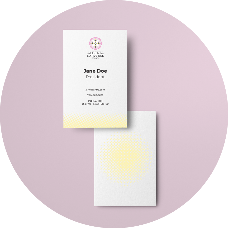
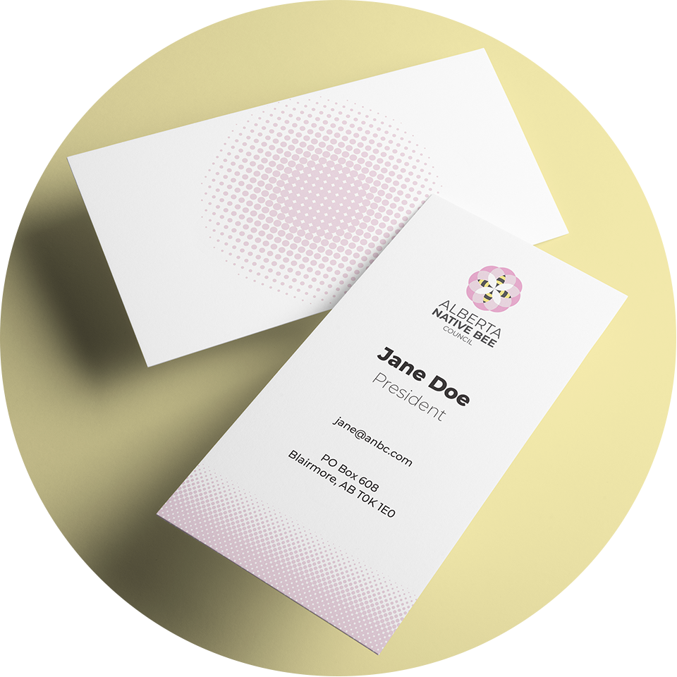
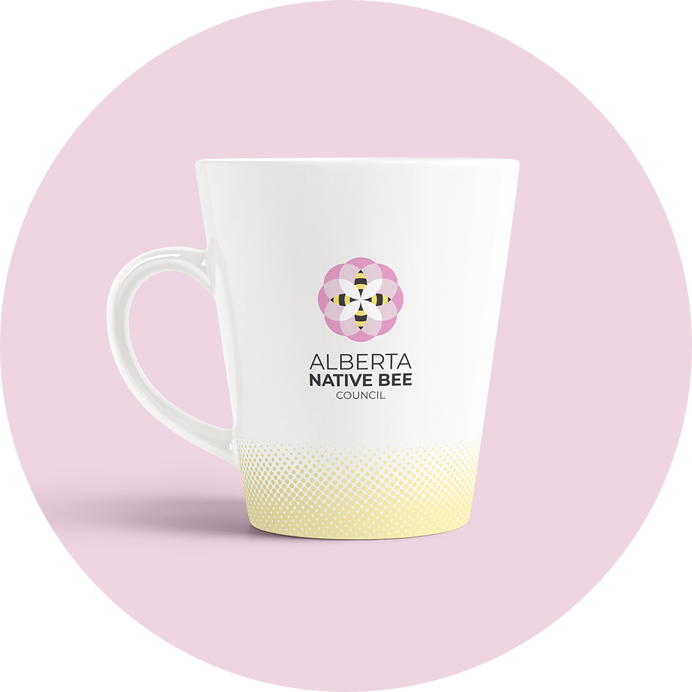
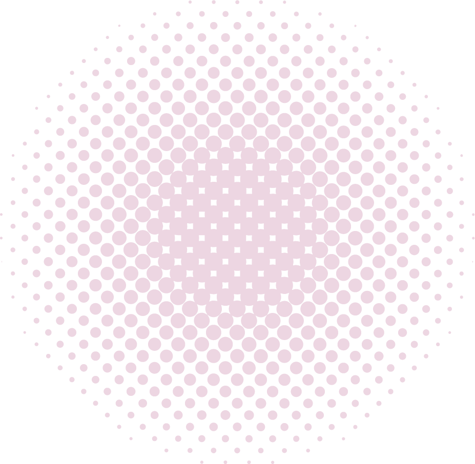
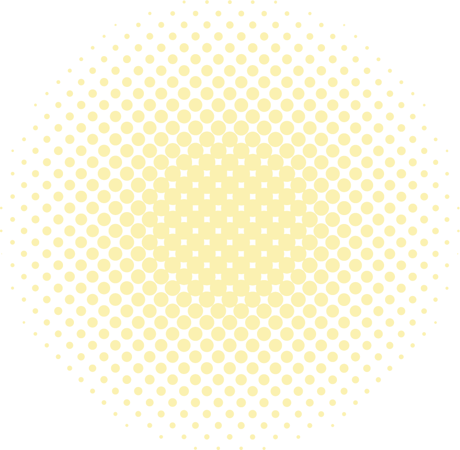
Halftone Gradients
Halftone gradients in the light pink (#EDD6E2) and light yellow (#FBF1B1) brand colours are both utilized on the bottom edge of branding materials. These halftone gradients were integrated to symbolize the particle shape of pollen and to add a ground to the bottom edge of branded materials to allow the bee logo to “fly” above it.
Final Notes
The mixture of the soft colour palette with geometric shapes allows this brand to resonate with the general population while still maintaining a professional & scientific quality.