Logo & visual identity for a professional tidying consultant

The Creative Brief
The Client
Spark Your Palace is the brand name of a professional tidying consultant certified in Marie Kondo's KonMari Method. If you've seen "Tidying Up with Marie Kondo" on Netflix, you will recognize the KonMari Method! KonMari Consultants don't just come in and tidy up your place, they teach you skills to declutter and surround yourself only with what brings you joy, intending to decrease stress and improve well-being.
The Project
The client was looking for a logo and basic visual identity for their new organization consulting business. The one major requirement from the client was that the full logo had to include "Spark Your Palace - Certified KonMari Consultant".
Logo Development
Research
To fully understand the service Spark Your Palace provides, I watched a few episodes of the Marie Kondo Netflix series. The main thing that I learned is that the typical customer is looking to add a sense of peace and joy to life through decluttering and organizing their home.
Brainstorming & Sketching
My thought process while sketching was; if a potential client were browsing online for a service to help them achieve a sense of peace and joy, they would be more attracted to a brand that evokes these feelings through their visual identity. To achieve this, I tried to stick with simple shapes and forms for the logo, staying away from any literal depictions of real-life objects.
Full Logo
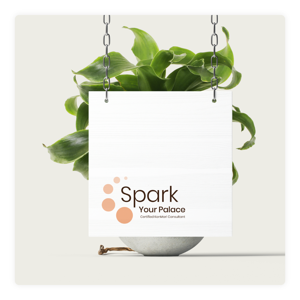
The icon used in the logo represents the process of change that Spark Your Palace clients go through while learning the KonMari Method. There are 5 circles, each representing one of the 5 categories of tidying in the KonMari Method.
The word "Spark" in the wordmark serves as a focal point for someone taking a first glance at the full logo. The change in scale of the 5 circles acts as a visual guide throughout the rest of the words.
Visual Identity
Logo Usage
The use of whitespace can say a lot about a brand. By placing the logo in the bottom left corner of whatever canvas it occupies, it gives the same sense of calm, organized simplicity that Spark Your Palace clients are seeking. See below for a few examples of the logo in action:


Colour Palette
The colour palette consists of earth tones that aid the calm, simple feeling Spark Your Palace is trying to bring to their clients. The orange used in the logo is a “spark” of energy to contrast against the other muted tones in the palette. This helps to draw a viewer’s eyes directly to the company name in the logo.
