Logo, visual identity, and illustrations for my online art shop
What is Splashing Elk Studio?
Splashing Elk Studio is a collaborative effort between myself and my partner, Alyssa. We’re most inspired when spending time in nature and would love to bring a bit of the outdoors into others' homes through our art. We create as a means of sharing our love for flora, fauna, and outdoor adventure. It’s that picture on your wall reminding you of that day, that place, that season, or that feeling.
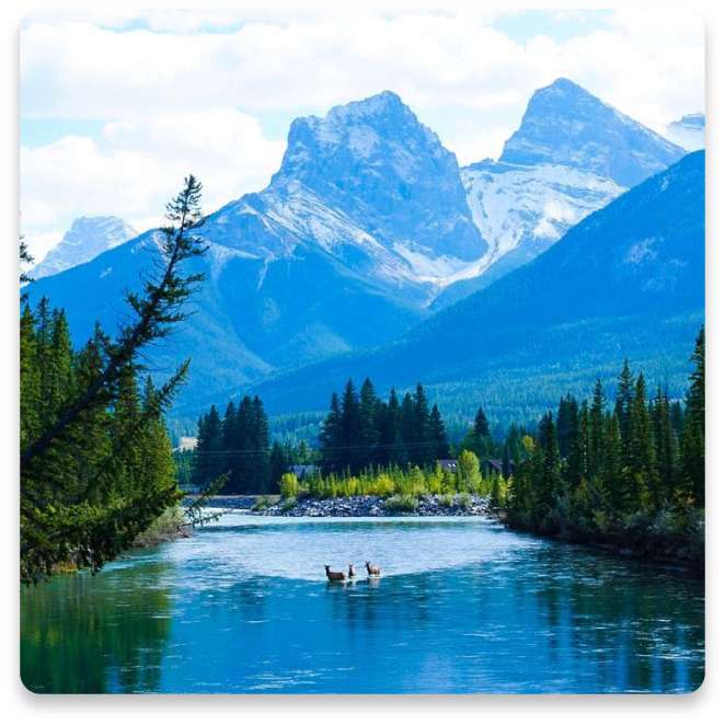
The name “Splashing Elk” comes from a trip to Canmore, Alberta (one of our favourite places). We were walking along the river, enjoying the mountain views when we heard a loud splash. Down in the river, some friends had joined us - a family of Elk taking a refreshing dip! We stood there in silence, just soaking it all in.
Logo Development
Sketching
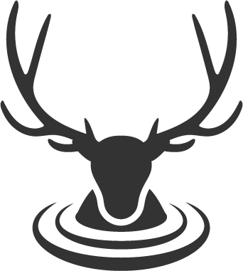
While exploring and sketching ideas, I started by incorporating a "splash" into a side profile of an Elk's head. I also tried options with the Elk head being viewed from head-on. This is ultimately the idea I chose to go with for the final logo because it allowed for a better representation of an Elk's icon large antlers.

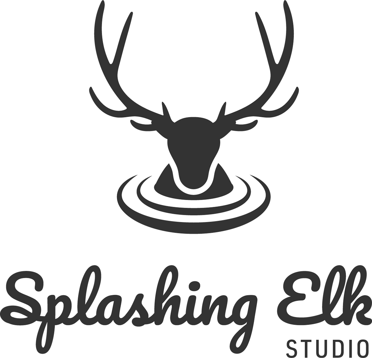
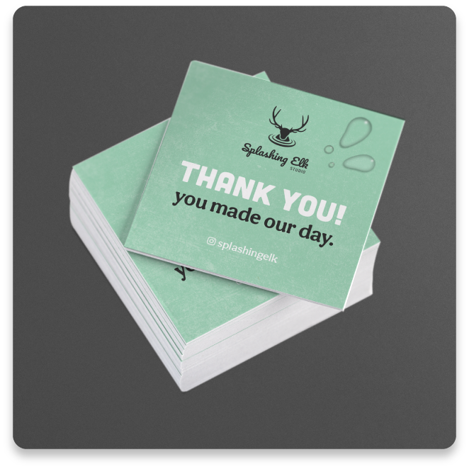
Final Logo
The final icon depicts an Elk creating ripples in water. The repetition in the water ripples draws the eye to the logo by creating a visual "target". The contrast in the weight of the ripple lines gives the image some depth.
The final product is a combination logo that includes a curvy, handwritten wordmark of the company name. The heavy weight and rounded edges of the lettering provides a nice balance between "fun" and "classic" feelings. It also pairs nicely with the simple vector illustration of the Elk icon.

Visual Identity
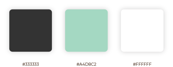
Colour Palette
The brand colours include dark grey, green-blue, and white. This palette has a youthful energy and fits with the "nature" theme of the artwork.
Typography
The fonts used on branded material include Cubano for headlines and Aesthet Nova for subheadlines and text. Cubano is loud sans-serif to capture attention, and Aesthet Nova is a serif font with a rounded quality with plenty of contrast between the thick and thin parts of its letters. I find that this type of font is common in outdoor equipment and apparel brands, so I applied it to Splashing Elk's visual identity to appeal to people with an interest in the outdoors.
Cubano
Aesthet Nova
Water Drops
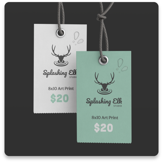
Another piece of Splashing Elk's visual identity is water drops. These drops are a play on the word "splashing" in the company name and serve to add visual interest and differentiation to the brand.

Splashing Elk Studio's Visual Identity at work
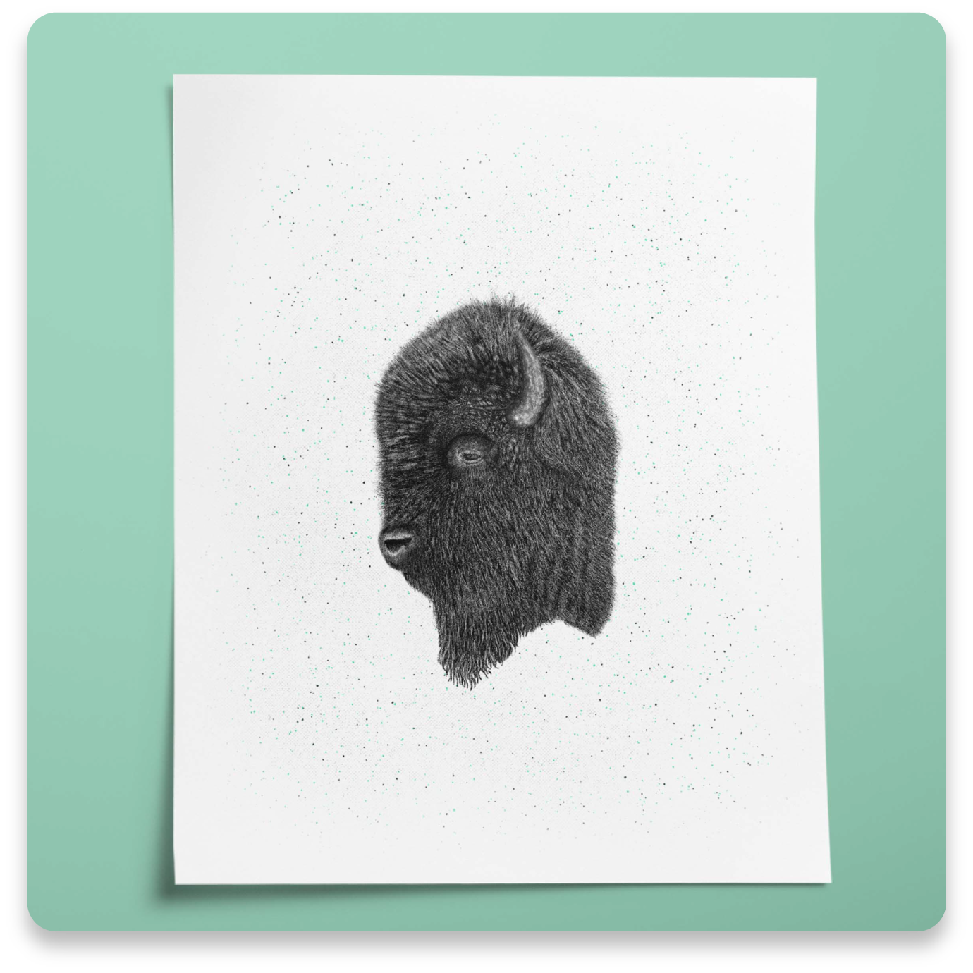
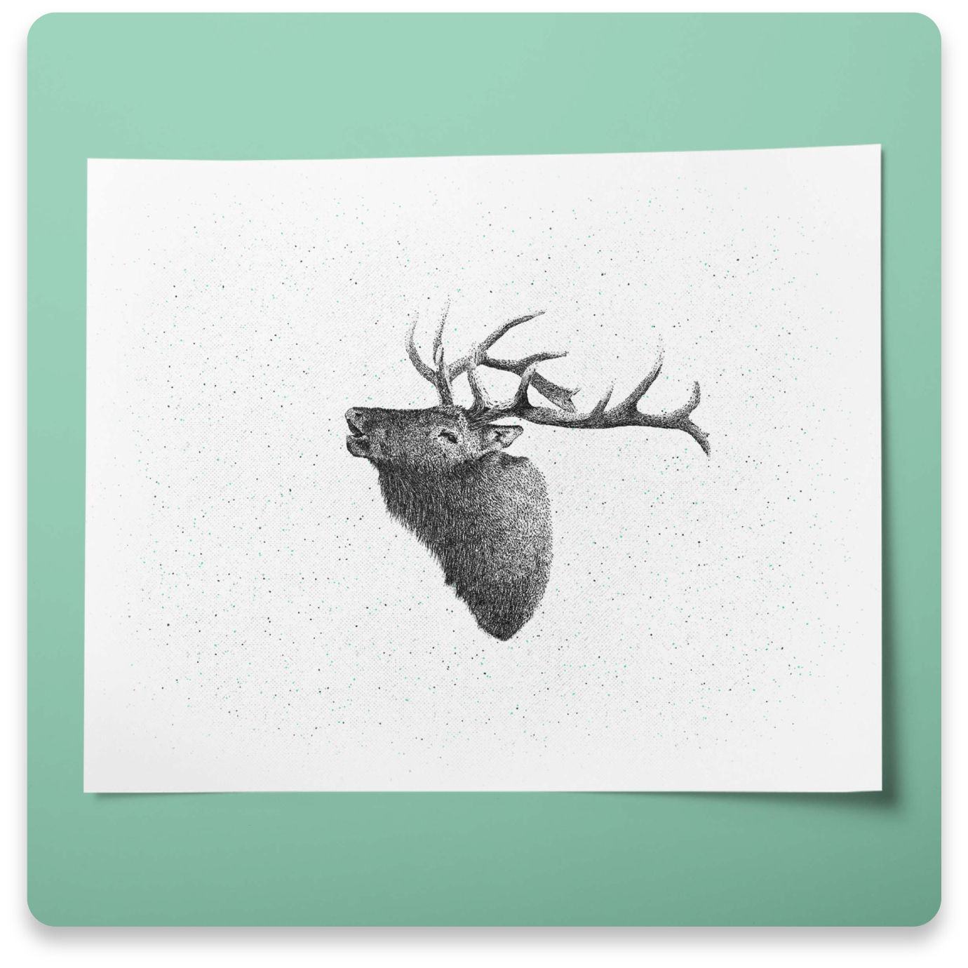
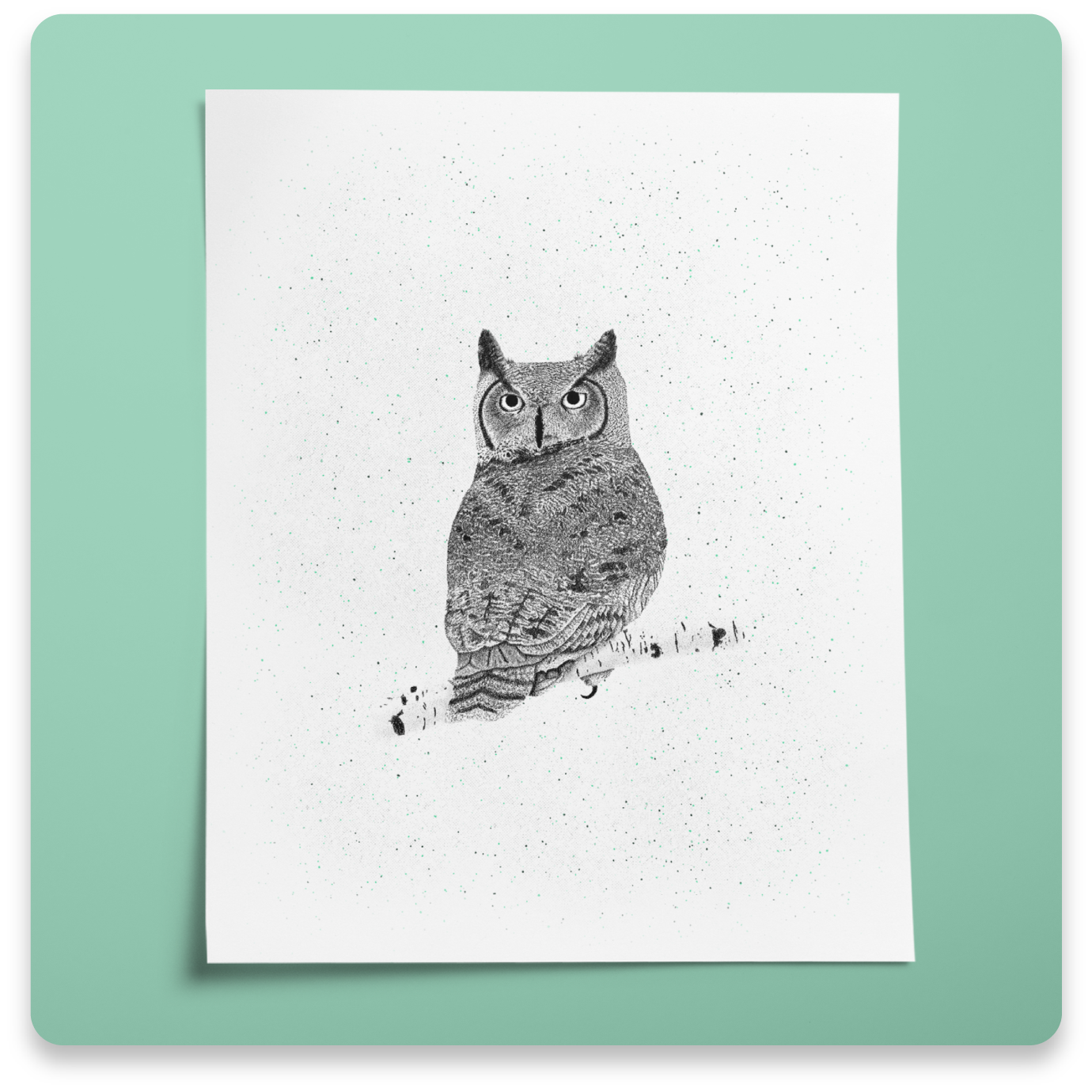
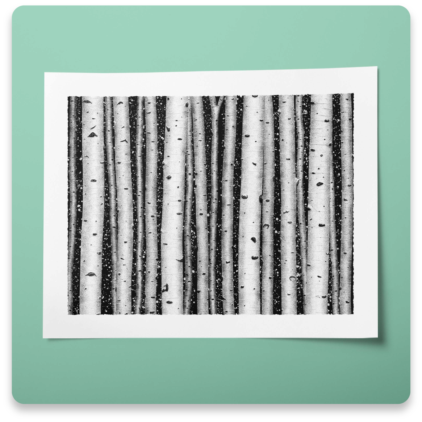
Illustrations
The illustrations I made to sell in the online shop are all done digitally using Adobe Fresco with a stippling brush. I love drawing with stippling because it allows me to focus on the texture of the subject I am drawing.