
Logo and UI design for a mobile hiking app
The Creative Brief
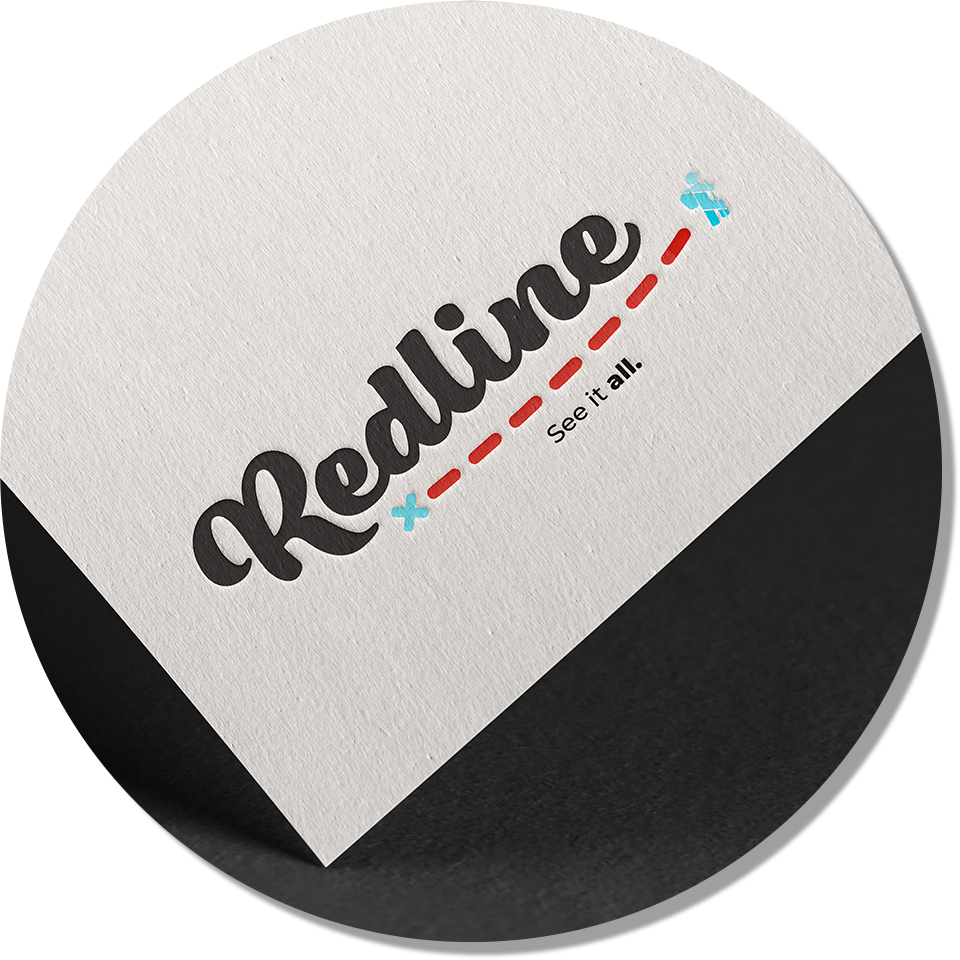
Redline Defined
While hiking, to "redline" an area is to cover every possible section of it, inch by inch. The term comes from the practice of marking each completed trail with a red line until there is no trail left unmarked on the map.
The App
Users can find a nearby trail suited to their skill level and track their activity while they hike. The key differentiator from other hiking/trail apps is that Redline tracks and prominently displays the user’s progress towards exploring every inch of a given trail system. Avid hikers and casual strollers alike can take up the rewarding challenge of seeing everything that an area has to offer.
The Logo
The logo for Redline is primarily a wordmark designed with a heavy, curvy handwritten typeface. It has a modern, youthful energy that will entice tech-savvy outdoors-people. Underneath the primary wordmark is imagery of a red line signifying a path that a hiker has taken. This serves to hint at the function of the app as well as to integrate brand colours.

https://www.anthonyboyd.graphics/mockups/embossed-logo-mockup/
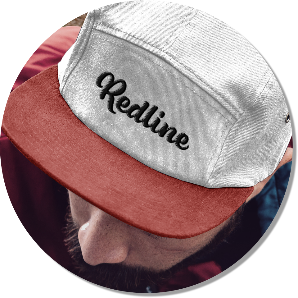
Examples of where the logo might be used with and without accompanying imagery and tagline.
The User Interface
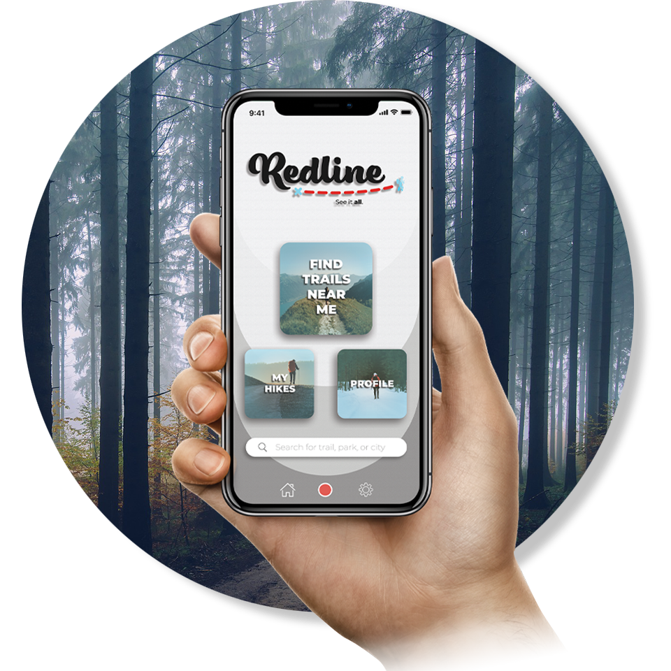
The Dashboard
The dashboard page is the first screen that a user will see when they open the app. It features a simple menu with large buttons that allows users to navigate to any area of the app.
A search bar allows a user that already knows what they are looking for to easily navigate to their desired information.
A search bar allows a user that already knows what they are looking for to easily navigate to their desired information.
The bottom navigation bar is consistent across all screens of the app. It includes a red circle that can be pressed to begin recording hiking activity, a home button, and a settings button.
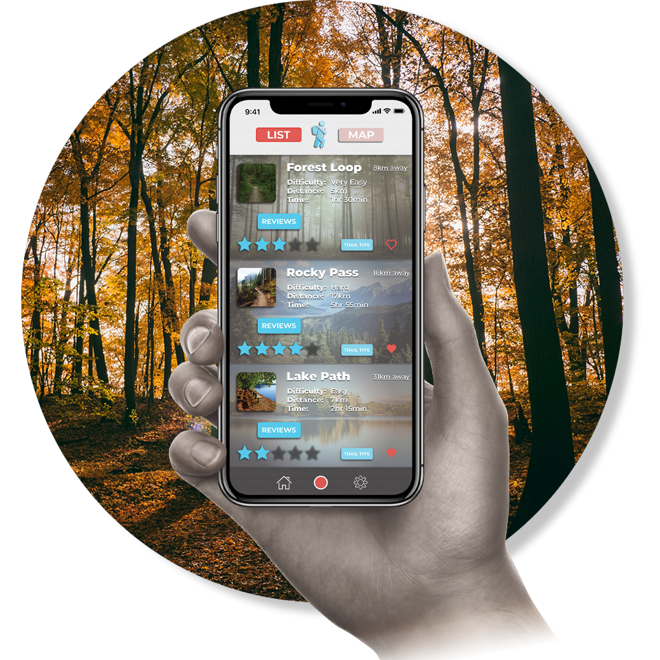
Find Trails
From this screen, a user can easily find the best hiking trails near them. They can look at a list view or map view to decide on where they would like to hike. Trail name, difficulty, distance, and approximate completion time are all prominently displayed so that the user can find the trail that suits them best. Users can navigate to reviews, tips, and photos that other users have left for that specific trail.
Trails can be saved to "favourites" by clicking the heart icon, making them easy to find later. Navigating to their chosen trailhead is made easy by clicking the underlined “distance away” button that will link to their default navigation app on their phone.
Recording Hiking Activity
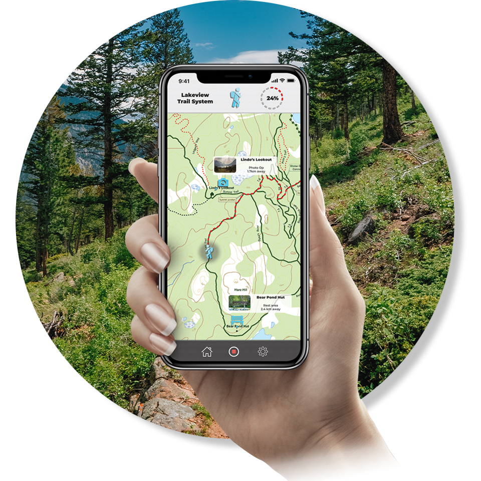
When a user hits the red record button, the app will begin tracking their activity using GPS. If they are hiking on one of the many trail systems programmed into the app, they will be able to see how close they are to completing the entire area, or “redlining” it.
They will be able to see where they are within the trail system, where they have been (as noted by a dotted red line) and where they have not yet been.
Displayed on the map are points of interest such as rest areas and photo opportunities that other users have marked for other hikers to enjoy for themselves.
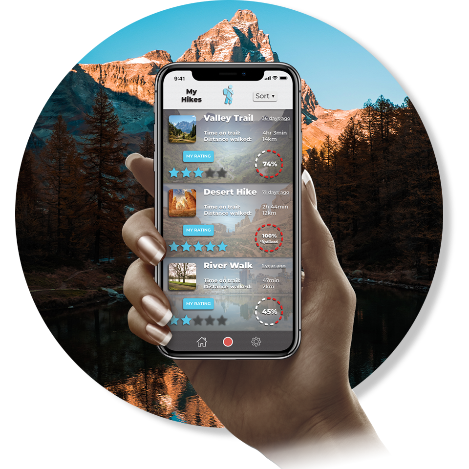
My Hikes
This screen allows users to see their past hiking activity recorded using the app. For each of their past hikes, the time spent walking, the distance travelled and the percentage of the trail covered are displayed.
The sort menu located on the top navigation bar gives the user the ability to determine the order that these past hikes are displayed. This is also where hikes that are favourited in the “find a trail” screen can be displayed. Users are also able to leave a rating, review, trail tips and photos to be viewed by other users.

My Role
I created the brand name and tagline as well as designed the logo, visual identity, and user interface for the app screens shown above.
Mockup used on this page: